top of page


Company
Pearl Academy
My Role
UX Research, Information Architecture, Navigation Concepts, UX Design, Hi-fi Mockups, Interaction Design, Design System, Project Management
Tools
Adobe XD, Zeplin, Photoshop, Illustrator, InDesign, Paper & Sharpie
Duration
6 months
Year
2019-2020
Background
Pearl Academy is India’s leading institute in Design, Fashion, Business, and Media and has been a catalyst for the success of students across creative industries for 28 years. The institution offers over 40 uniquely designed courses throughout India.
Here, I worked on the Pearl Academy mobile application, the aim was to keep applicants engaged by providing information and guidance throughout the application process.
This project is protected by NDA. Hence, I can showcase limited information publicly.
Overview
How can we design an application that engages applicants by providing continuous information, guidance, and reducing the dropout rate during the application process?
I was lucky enough to have the opportunity to create the Pearl Academy application from the ground up.
I was a Product designer in a team of 3 people
(1 Product Manager, 1 Design Lead, and myself - Product Designer).
Apart from UX and Visual Design and shipping products live, I spent most parts of my day in communication with Users, Product Managers, and Developers.
Impact
27% growth in volume, with a 68% reduction in dropouts.
Understanding Business
Why do we need this Application?
-
To establish a differentiated experience for applicants and foster impactful conversations from the initial application stage through to enrollment.
-
With the goal of maintaining applicant engagement, we aim to deliver valuable information and guidance through our mobile app.
-
The mobile application will serve as a convenient extension to the web portal, providing students with easy access and eliminating the need for frequent logins. Its enhanced engagement features make it a valuable tool for students on the go.
-
The mobile application will serve as a comprehensive repository of information regarding courses, universities, and all relevant details pertaining to the admissions process.
-
The aim is to provide applicants with a sense of exclusivity and personalized experience.
Understanding the Users
Who are the target users?
The application specifically caters to applicants who have expressed interest and applied for admission at Pearl Academy. Many of these individuals may have also applied to multiple (6-7) colleges and paid a nominal fee.
Vision
"
To engage prospective applicants by providing an exclusive repository of information that leads to the realization of institute’s values resulting in greater enrollment
"
Opportunity
Inspiring creative minds to look beyond
the conventional and explore Design,
Fashion, Business & Media education to
disrupt the future.

The Solution | HOW
Key Activities
● Consulting
● Stakeholder Workshop
● Visual System
● UI UX Design
● Prototyping
● Product Development Coordination
We adopted a collaborative approach throughout the design process, involving stakeholders at every stage to evaluate and recommend diverse customization options that align with the needs of our primary users. This ensured the integration of exceptional user experience (UX) elements, essential for highlighting the brand value and creating a student-centric mobile application.


The Solution | WHAT
● Through close collaboration with the business and product teams, we diligently identified their requirements and gained a comprehensive understanding of the product vision.
● During the design process, we carefully consolidated all the business and strategic inputs gathered from workshop sessions and presentations. This allowed us to derive the key values that guide our design directions for the application.

Key Features
● Application Status
● Updates as stories for regular engagement
● Notifications for important events and happenings
● Customized journey to take applicants through latest trends, leadership articles, and inspirational videos as per
applicant’s interest
● Schedule a campus visit
● One-on-one interaction with career advisors
● Discussion forum to discuss with fellow applicants

Information Architecture

User Testing on Low-Fidelity Screens
Goal
Enable Pearl Academy application users to navigate through the application and finish the tasks
Impact
Reduces the number of support tickets sent → Saves company more time
Tool
Marvel App
#Users Tested
12
Metrics
• Task Completion Rate
• Satisfaction Rate
• Qualitative Feedback
Tasks
1. Log into the application
2. Schedule a Visit
3. Learn about the Faculty
4. Watch a video in the Spotlight
5. Register for an Event
Insights
Users found the Onboarding Screens to be text-heavy and ineffective in conveying information accurately


Users expressed the desire to have their Application Status prominently displayed on the homepage until they received an Admission, leading them to frequently check the application


Users expressed their desire for a convenient Register button within the notifications section, enabling them to swiftly navigate to the registration page with a single click and streamline the process


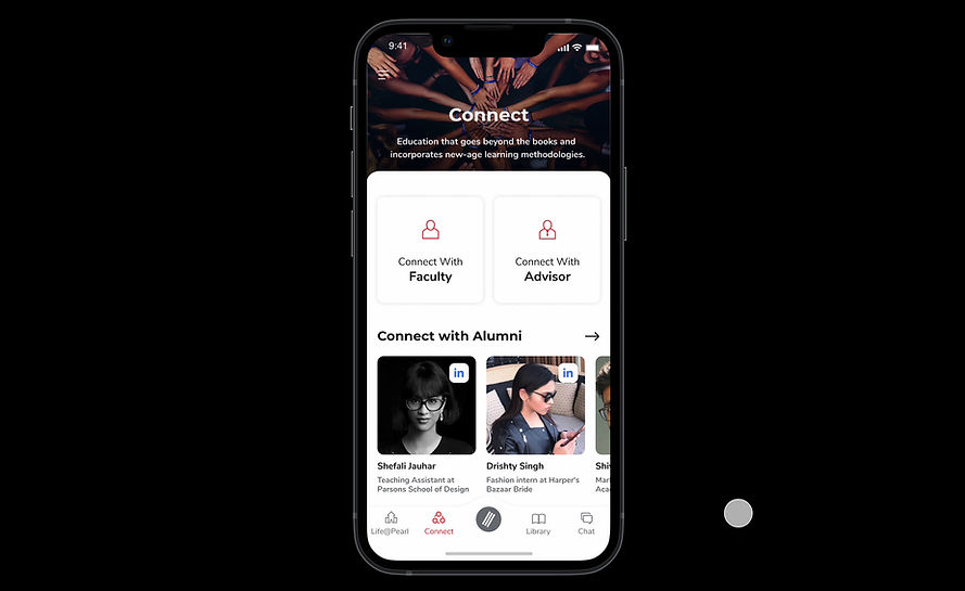
Users wanted a feature that facilitates connections with seniors, alumni, and faculty to gain insights into their experiences and gather valuable information
Users experienced confusion regarding the navigation within the discussion panel, including locating past discussions and associated comments
Design Concept


Accessibility Audit
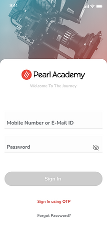
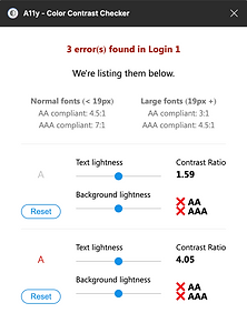


Before


Before


Before
Fixed


Fixed


Fixed
In order to prioritize accessibility in our application, we utilized the A11y Accessibility Tool to assess the contrast ratio of text and button colors, ensuring compliance with WAG AA standards. Moreover, we improved legibility and minimized cognitive load by implementing the Montserrat and Nunito Sans fonts. Additionally, we opted for neutral colors in illustrations and photos to reduce visual distractions and enhance user experience
WCAG AA
checked

Key Solutions
Enhanced the onboarding experience by providing visual aids that enabled users to accurately understand the information presented

Display Application Status prominently on the homepage until admission is received and add a convenient Register button in the notifications section for streamlined navigation and improved user experience

Providing users with personalized access to relevant articles and videos based on their course preferences, enabling them to proactively learn and gain a deeper understanding of concepts ahead of time

Enhance the navigation of the discussion panel with clear labels and icons. Introduce search functionality for easier access to specific discussions or comments. Implement threaded discussions, bookmarking, and notifications for improved organization and user engagement
Reflections
How did I feel when working on the project?
This project holds personal significance as it aims to empower students, reducing barriers and fostering confidence in their transition to college. It aligns with my passion for increasing access and equity, driven by my own background and the challenges I faced due to limited resources. Moreover, it enables students to connect with valuable resources and make informed decisions about their educational journey.
What would I have done differently?
Although our focus was on designing the user-facing side, I had a keen interest in envisioning the platform from the perspectives of faculty and alumni. Given additional time and resources, it would have been valuable to explore the design of their experiences and develop comprehensive flows. Additionally, I would have delved deeper into gamifying education and conducted multiple rounds of user testing to iterate and refine the design based on user feedback.
enhancing the student experience and driving a
27% growth in volume,
with 68% reduction in dropouts
Live Application
bottom of page