top of page


Company
Cradles to Crayons
My Role
UX Research, Stakeholder Management, Market Research, Information Architecture, UX Design, Hi-fi Mockups, Interaction Design, Design System, Visual Design
Tools
Figma, Photoshop, Illustrator, Paper & Sharpie
Duration
4 months
Year
2020-2021
Background
Cradles to Crayons provides kids with the essentials they need, free of charge. When the pandemic prevented physical operations, their focus shifted to expanding their online presence and increasing their impact in serving vulnerable communities.
To empower their vision, we followed a donor-centric design approach to digitize the donation action. Presenting "The Giving Factory Direct," with enhanced user experience and simplified process.
This project is protected by NDA. Hence, I can showcase limited information publicly.
Overview
How can we navigate the transition from a traditional offline business model to a digital platform, while effectively addressing the needs of children and incorporating various physical aspects?
I'm grateful to contribute to a project that positively impacts children's lives, making a meaningful difference.
I was a senior product designer in a team of 4 designers
(1 Design Manager, 1 Product Designer, 1 Visual Designer, and myself - Senior Product Designer)
Impact
Achieved a Net Promoter Score of 98
Our Road To Delivery

Problem Statement - Why there is a need?

Research Process - 3 Ws and an H
An overall digital transformation strategy for Cradles to Crayons for addressing their mission of providing kids with the essentials.
The Research plan addresses the above objectives in the following ways:

Segments - Whom are we addressing?

Focus Area - Three Phases

Contemplate Market Strategy
We did a market analysis of the top three competitors for Cradles to Crayons: Room to Grow, Catie's Closet, and Good Plus Foundation.
From the insights of this study, we were able to recommend some great features for the donor platform and design a user journey that removes friction and increases engagement.


Understanding the Users
• The aim of conducting user interviews was to understand the current ways of working and how this service is being used by Cradles to Crayons users
• To understand their needs, goals, and challenges
• Defining the various user groups as personas
• Donors
• Partners

Insights
A Picture!
Putting a face to a name would have been really special. It would make the impact seem greater.
It would be really nice if we were assigned a child that we grow with. As he gets older, and seasonally, we send an Outfit Pack, or as we’re buying back-to-school supplies, I buy for my kids, that would be a really nice long-term relationship.
If you can get someone to underwrite shipping for boxes, that removes one step for our particpants, makes it a bit easier.
When I saw that it goes to an individual child, you’re doing something for a particular child, not just donating a lump to goodwill, it just interested me a bit more.
Design Approach
We took a user-centric view to design based on user’s needs and wants

Ideate, Combine & Iterate
We conducted workshops and iteration sessions with the clients and users at regular intervals to keep the evolution alive.
We were able to design and prototype simultaneously to build an efficient and cohesive digital platform.


Tailored Donation Platform
Our challenge was to bring the ‘Giving Factory’ experience onto a digital platform.
To achieve that, we studied our users and developed a storyboard and journey map to identify the key opportunity areas.
We also created an application flow followed by wireframes and visual designs. This iterative process helped us in identifying the key platform capabilities and prioritize the roadmap for our donor.

Evaluate User’s Pain Points
We created a holistic end-to-end blueprint journey of our users to keenly observe the opportunity areas and touchpoints to identify features for our product enhancement.
The well-communicated feedback from the clients and the team’s continuous effort in implementing it refined the designs progressively.

Intuitive Access To Information
The platform fast-tracked the process of finding a match with its matching engine that matches a donor with a kid based on the details provided.
We catered to the need of our users by providing options to select among categories of gender, size, and packs.
The platform gives live status updates of active/non-matched and the history of donations.

Design System
Foundation
The foundation of a design system is the spacing and grid system. Like a house needs a solid foundation, a design system relies on spacing and grids.
They are often overlooked in visual design but can significantly impact the overall look and feel. In this project, I used an 8pt grid system with a 12-column grid and an 8px baseline grid. The spacing system aligns with the 8px grid using rem units. I chose an 8pt system to ensure responsiveness, as it aligns with common screen sizes and helps prevent anti-aliasing.


Typography
When selecting a font for the web, I opted for Proxima Nova due to its clean and adaptable nature. The geometric shape of the letters and the spacing between characters are ideal. Additionally, Proxima Nova offers a wide range of weight variations, making it suitable for both headings and body text, and enhancing its visual appeal.
Iconography
Icons play a crucial role as visual aids in assisting users with task completion. In the Giving Factory Direct design system, we have crafted our own icons to ensure simplicity, informativeness, and seamless integration with the overall visual language of the design system.


Color palette
Clear communication takes priority over aesthetics when it comes to color selection. Colors in Giving Factory Direct have specific roles and meanings within the interface, aiding in information hierarchy, interactivity, and element differentiation. This deliberate approach allows for easy customization and extends the color system across various touchpoints.
Buttons
While many people are familiar with buttons, non-designers often overlook the fact that a single button can have multiple states. These states typically include active, hover, focus, disabled, and sometimes a loading state.
Each button type also has an associated icon version. Below, you can observe examples of buttons in various states.


Accessibility Check

To ensure accessibility in our application, we utilized WAVE and ANDI as tools to measure the contrast ratio of text and button colors, ensuring compliance with
WAG AA standards. We prioritized legibility and reduced cognitive load by implementing the font Proxima Nova. Furthermore, we chose neutral colors for illustrations and photos to minimize visual distractions.
WCAG AA
checked

Impact At Times of Pandemic
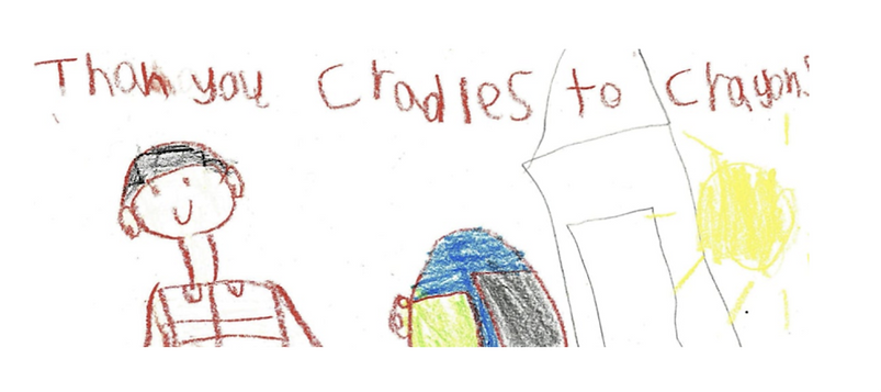
Our extensive research and elaborate approach alongside the business inputs; led to the creation of a seamless responsive interface for our clients.
The customer’s Quality=Dignity mission and the Giving factory experience were recreated in our designs with the key principles of simplicity and usefulness.
We collaborated with experts from different teams with unique, cross-functional perspectives to deliver quality work and impactful solutions.


Learnings & Reflections
User empathy: Designing for children requires a deep understanding of their needs and preferences. Through this project, I have developed a stronger ability to empathize with users and design solutions that cater to their unique requirements.
Safety and security: Building a digital donation platform involves handling sensitive information. I have realized the significance of implementing strong security measures and privacy protection to safeguard children's data and maintain trust.
Social and environmental responsibility: Designing a kids' clothing donation platform prompts reflection on social and environmental responsibility, encouraging reuse and reducing waste.
5%
increase in donations
bottom of page